Bedroom Colour Psychology: Colours That Promote Sleep
📅 March 2026 · ⏱️ 5 min read · ✍️ Budget Interiors Design Team
Bedroom Colour Psychology: Choosing Colours That Promote Sleep
The colour on your bedroom walls affects how you feel in that room every single day — not in a vague, theoretical way, but through measurable physiological responses. Colour temperature influences cortisol and melatonin production, saturation affects perceived room temperature (important in Chennai's heat), and hue influences the mood you bring into and carry out of the room. Getting bedroom colour right is one of the highest-value, lowest-cost decisions in interior design. Here's the science and the practical application.
Colours That Promote Rest — and Why
Muted blues and blue-greens: Blue is consistently rated in sleep research as the most restful bedroom colour. The physiological reason: blue wavelengths signal daylight and alertness in high intensity, but muted, greyish blue tones (think dusty blue, slate blue, soft teal) have the opposite effect — they reduce heart rate and lower blood pressure. In a Chennai bedroom where the goal is to decompress from a hot, active day, a cool blue wall creates the right psychological environment.
Warm greens (sage, olive, eucalyptus): Green signals safety and nature, reducing the alert-state that stressful days leave you in. Warm greens — particularly the sage and eucalyptus tones popular in contemporary Indian interiors — are calming without feeling cold, which matters for Chennai's aesthetic sensibility where stark cool colours can feel uncomfortable.
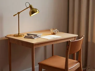
Warm whites and creams: The safest backdrop for sleep-promoting bedroom design. Not stark white (which reads as clinical and can feel cool at night), but warm cream, off-white, or very light warm grey. These colours expand the room visually, reflect natural light during the day, and provide a neutral backdrop for warm bedding and lighting at night.
Colours to Avoid in the Bedroom
Bright reds and oranges: These are energising and appetite-stimulating (which is why they're used in restaurants). In a bedroom, they work against the wind-down process. Even a feature wall in a vivid red or burnt orange creates an environment that promotes activity rather than rest.
Pure white: Surprisingly disruptive in bedrooms. Pure white looks beautiful in daylight but at night under artificial light it reflects hard shadows and feels clinical. The fix is simple: choose a white with a warm undertone (ask your paint supplier for whites with yellow or red undertones rather than blue undertones).
Dark, saturated colours on all four walls: A deep navy or forest green on a single feature wall is dramatic and beautiful. The same colour on all four walls in a standard Chennai bedroom (120–160 sq ft) makes the room feel oppressively dark and smaller than it is. Use deep colours as accents, not envelope.
The Chennai Context: Colour and Perceived Temperature
In a city where ambient temperature is 30–38°C for much of the year, colour temperature in the bedroom has extra significance. Cool blues and blue-greens create a psychological sensation of coolness — not a physical temperature reduction, but a perceived one that slightly reduces discomfort. Warm oranges and reds have the opposite effect. This isn't a major effect but it's real and worth factoring in when choosing your bedroom palette.
Practical Colour Recommendations for Chennai Bedrooms
- Master bedroom: Warm white or cream walls, one feature wall in sage green or dusty blue behind the headboard
- Children's bedroom: Warm white walls, one feature wall in a more energetic but not overpowering tone (soft yellow, warm teal, muted coral)
- Guest bedroom: Universally pleasing — warm grey or warm white throughout, neutral and restful for anyone
Practical Guide for Chennai Homes
When considering bedroom colour psychology: colours that promote sleep for a Chennai home, the climate and local living patterns play a significant role in the right approach. Chennai's combination of monsoon humidity (peaking at 85–95% RH during the northeast monsoon), year-round heat above 28°C, and — in coastal areas — salt air creates specific requirements that generic interior design advice often overlooks. Every decision in this category should be evaluated against Chennai's specific conditions, not just aesthetic preference or price alone.
The most successful Chennai interiors in this category share a common thread: materials selected for local climate performance, specifications adapted for intensive Indian household use, and maintenance requirements that are realistic for a working Chennai family. This means prioritising durability and ease of maintenance alongside aesthetics — choices that look identical in a showroom but diverge significantly in performance after three monsoon seasons.
Budget Interiors has completed projects across Chennai — from Perumbakkam and OMR to Kilpauk, Anna Nagar, and Adyar — giving us a clear picture of which approaches hold up and which fail under local conditions. The guidance in this article draws from that project experience, not from generic design principles.
Materials and Specifications That Matter
For any fixed interior work in this category, the specification of structural materials — particularly plywood — has a disproportionate impact on long-term performance. ISI-certified BWR (Boiling Water Resistant) plywood, manufactured to IS 303 standard by brands like Century Ply, Greenply, or Kitply, is the minimum appropriate specification for Chennai's humidity conditions. This is the plywood that won't warp, swell, or delaminate through the northeast monsoon cycle year after year. Budget Interiors uses ISI-certified BWR plywood on all structural carcass work as standard — not as a premium upgrade, as the baseline.
Surface finish choices should consider where in the home the work is located and what exposure it will face. Kitchen and bathroom-adjacent areas require different specification from bedroom furniture. Hardware selection — hinges, drawer runners, handles — similarly needs to account for load, use frequency, and moisture proximity. Soft-close Hettich hardware on kitchen drawers handling heavy Indian vessels is an investment that pays back in daily usability and decade-long performance; local-brand alternatives save ₹15,000–25,000 upfront but typically require replacement within 5–7 years of intensive use.
Planning and Budgeting Realistically for Chennai
Realistic budget planning for this type of interior work in Chennai involves understanding the total cost of ownership, not just the installation cost. Materials with higher upfront cost — ISI plywood over commercial grade, Hettich hardware over local alternatives, quartz countertops over granite — typically have lower total cost over 10 years when you factor in the avoided replacement and repair costs. The calculation is specific to Chennai because our climate accelerates material degradation in ways that make the quality premium more valuable here than in milder climates.
Getting an accurate quote requires providing accurate inputs: your flat's actual dimensions, your scope of work in detail, and your material preferences. Quotes based on approximate dimensions or vague scope are not comparable — a quote for "kitchen with wardrobes" can represent anything from ₹4 lakhs to ₹15 lakhs depending on specification and scope. Budget Interiors provides itemised quotes with every material and component specified by name and grade, so you can compare our numbers directly with any other vendor's on equal terms. The free site visit and 3D consultation is where this specificity begins.
Questions to Ask Your Interior Designer
Before committing to any interior project in this area, these questions help distinguish professional vendors from those who will disappoint: "What plywood grade and brand do you use, and can you show me the ISI certification?" — the answer should be specific and verifiable. "What hardware brand do you specify for the moving parts?" — again, specific brand and model, not "good quality hardware." "What warranty do you provide, and what does it cover specifically?" — duration, what failures are covered, and the rectification process should all be explicit. "Can I visit a completed project similar to what I'm planning?" — most satisfied clients will accommodate this when asked, and a site visit reveals quality that photography cannot.
Budget Interiors offers 10-year warranty on all project work, 15-day delivery commitment once materials are confirmed, and free 3D design consultation before any payment commitment. These commitments are written into every project contract, not verbal assurances. Contact us for a site visit and quote — we're available Monday to Saturday, 9am to 7pm.
👉 Explore our Bedroom Interiors options in Chennai
See Bedroom Interiors designs & pricing →Ready to Transform Your Chennai Home?
Get a free 3D design consultation from Budget Interiors.
Get Free Design Consultation WhatsApp NowExplore Related Pages
Interested in this topic? View our wardrobe designs Chennai — or learn more about our bedroom interior design.

